
Scott McCloud's "Understanding Comics" Is Charming, but It's a Giant Mess
Why McCloud's theory has generated more confusion than clarity about the great lowbrow art form -- featuring lots of PICTURES!

You’re reading Steam Calliope Scherzos, a blog that unceremoniously crams together non-structuralist semiotics with various inquiries into media ecology.
Intro
It feels strange to criticize Scott McCloud’s Understanding Comics more than thirty years after its initial publication in 1993. Plenty of others have already done so in the field of Comics Studies (yes, this is an actual field), including Thierry Groensteen, Bart Beaty, Scott Bukatman, Charles Hatfield, R.C. Harvey, David Carrier, and more. Since McCloud’s work was published, there have been plenty of competing accounts about what comics are, what they’re meant to do, how they work on the mind, and so on. But the thing is, McCloud is the only one who made an explanation of comics that is actually fun to read, and so he remains the top guy, whether you like it or not. Out of all the existing accounts, his formalistic approach to comics has been the most influential by far, and Understanding Comics has been a required text for students in many different university courses dealing with the topic. Additionally, he has probably been highly influential in the elevation of comics as a valid middlebrow mode of storytelling. When you see publications like Newsweek, NPR, and BBC News release lists of the top 100 novels from the last fifty years (or whatever), you’ll now see Art Spiegelman’s Maus (1980-1991) or Marjane Satrapi’s Persepolis (2000-2003) on those lists pretty commonly. I think that McCloud has played a significant role in building up the confidence for educated people to treat comics as literature — for better or for worse.
And to be sure, Understanding Comics gets a lot right. Above all else, it’s clear that McCloud is really, really into comics, and that’s my favorite thing about the book. His enthusiasm is infectious. When he references artists like Osamu Tezuka, José Muñoz, R. Crumb, Dave McKean, or Sergio Aragones, you think to yourself, “Man, I should check out more of that guy’s stuff! Wow!” Additionally, I think he’s more or less right about many of the things for which he’s been criticized. His discussions on “closure,” the importance of the “gutter” between panels, sequencing, the compression or expansion of time, the six types of panel transitions, and so on, are all basically right. I’m sure that they all have minor conceptual flaws that niggling academics have made sure to correct, but they’re right enough to be useful, and that’s what matters.
I also will say that I disagree that comics necessarily need to be studied from an historical or sociopolitical lens instead of a formalistic one, as some of McCloud’s critics have argued. It’s perfectly valid to study comics as a mode of storytelling from a formalist standpoint with less emphasis on history, and I don’t think it’s productive to just whine about one school of theoretical criticism while promoting another. The reality of academia is that just about everything will eventually be approached by just about every school of thought, and there’s little to be done about it. McCloud was at least passionate about analyzing comics in the way he chose, and he did it on his own accord. He wasn’t just haplessly trying to secure tenure at some backwater university in the middle of nowhere because his life had become nothing more than a constantly-shrinking prison cell. This alone speaks volumes, and it suggests that the vantage point he took is worth something and deserves to be taken seriously. And besides: professional academics study works (or genres) of literature from far dopier theoretical vantage points.
However, there is something that I think he gets very wrong about comics. It doesn’t come from his approach, or his definition of comics, either, which may be a bit too liberal but which I still don’t have much of a problem with (who cares about definitions, anyway?) Instead, it concerns something even more basic, and it’s how he conceptualizes the relationship between language and images. I’m into both semiotics and media ecology, so I think about this topic often. For comics in particular, it’s the essence of the art form itself. So for the big fans of McCloud, understand that I’m not just trying to crap all over him for no reason — I actually think that his work acts as a springboard for some decent takeaways on not just comics as an art form but also semiotics and media ecology. Even if these takeaways must be adversarial.
I. The Semiotix of Comix
McCloud’s characterization of the relationship between images and language — let’s just acknowledge this at the outset — comes from what seems to be an insecurity about the content found in comic books, which is often seen as simplified, childlike, and distinctly non-literary. This perception would have been a big problem for McCloud, who was writing a conceptually ambitious treatise on the topic back in 1993. Back then, the main problem with taking comics seriously was that they’re for dummies, you know. Little children. People who can barely read. Nowadays, everybody can say they enjoy comics, and it’s no longer a guilty pleasure — but not then. During the early 90s, only the really smart guys could say that they enjoyed comics, like the famous novelist and semiotician Umberto Eco, an avowed fan of American strips like George Herriman’s Krazy Kat and Italian fumetti such as Corto Maltese. But he could say this as a way of flexing, basically: it indicated that he had intelligence to spare.
However, despite the shift in cultural perception since then, comics themselves really haven’t changed all that much. The first theorist on comics, and also the inventor of the modern comic, was Rodolphe Töpffer, and McCloud both cites him and draws some influence from him as well. Yet Töpffer, as revolutionary as he was, had no illusions about the kind of audience to whom his work would appeal. About the comic book, or “picture story,” he had this to say:
The picture story, to which the criticism of art pays no attention and which rarely worries the learned, has always exercised a great appeal. More, indeed, than literature itself, for besides the fact that there are more people who look than who can read, it appeals particularly to children and to the masses, the sections of the public which are particularly easily perverted and which it would be particularly desirable to raise.1
So for him, a comic isn’t real literature, it’s something children can understand, and it’s mostly valuable as a source of moral instruction, which is sorely needed because the derelict artists of the contemporary world are constantly forgetting about the importance of such things. And when you look at Töpffer’s words, it seems clear that people still basically feel the same way today, though they might not want to admit it. Why is it that Marvel Comics is so “woke,” as its conservative critics love to point out? It’s because the writers recognize that comics are good tools of moral instruction for the semi-literate masses. So, not much has really changed since the mid-19th century when Töpffer was active. The main differences are that 1) society is less literate than before, and 2) educated people now read comic books with less shame. Maybe these two things are related. Who knows.
But for McCloud, Töpffer’s sort of thinking simply won’t do. He indicates throughout his book that comics deserve to be taken just as seriously as their neighboring yet more highly esteemed art forms like novels, paintings, and film, and so he won’t brook the commonplace that “comics are just kids’ stuff.” To offer an alternative perspective, he establishes a semiotic theory designed to elevate the artistic value of the cartoon character, the fixture of modern comics from the nineteenth century all the way up to the present. And this is where I begin to get irritated. One charitable discussion on McCloud claims that he recreates and elaborates upon the theory of signs established by Charles Sanders Peirce. Peirce proposed a tripartite scheme for the classification of signs, which he divided into symbols, icons, and indexes. Now, McCloud does discuss icons and symbols… but given how far his definitions of symbols and icons differ from Peirce’s, I suspect that he either had never heard of Peircean semiotics at the time of his writing, or he simply didn’t care enough about it to take it seriously.
Here is how Peirce defined icon, index, and symbol:
Icon: A sign that represents something through resemblance or similarity (e.g. a portrait, a map, onomatopoeic words like “ZAP,” a musk-scented perfume, a grape-flavored soda, an Audubon bird-call)
Index: A sign that represents something existing in a specific place and time through a direct connection or causal link (e.g. smoke indicating fire, a weathervane indicating wind direction, footprints, bullet holes, jaundiced skin, the smell of fresh-baked cookies coming from downstairs)
Symbol: A sign that represents something through convention, habit, or learned rules, and not through motivated resemblance or connection (e.g. spoken words in a language, mathematical notation, music notation, traffic lights, country flags, coats of arms).
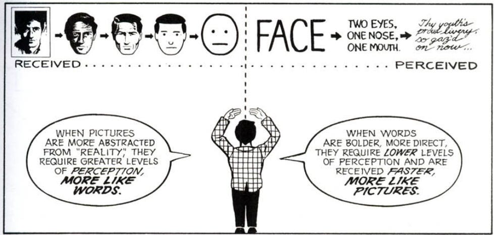
For McCloud, however, an icon is “any image used to represent a person, place, thing, or idea.” So, basically, an icon is any representative visual image, even when the referent is abstract. This is an incredibly wide definition. “Symbols,” then, are just one species of an icon, and they include things like the Christian cross, the “Om” insignia, the swastika, the peace sign, national flags, corporate logos, and traffic lights. Stuff like that. Letters, scientific notation, and numeric signs, however, are not symbols. They’re a different subsection of icon entirely, and McCloud doesn’t bother to give them a special name. Now, despite the massively inclusive definition he gives to “icon,” according to McCloud, some pictures are “more iconic than others” because “as resemblance varies, so does the level of iconic content.” You got that? Yeah, I don’t follow that, either. It’s simply impossible to know what that statement means on its face, and McCloud seems to realize it, so he proceeds to demonstrate what he means, essentially forcing us to come up with a new, truer definition of “icon” based on inference.
We come to find that for McCloud, a genuinely iconic picture involves something like the bare minimum amount of information to convincingly portray its referent. Think of the nine-stroke portrait of Alfred Hitchcock:
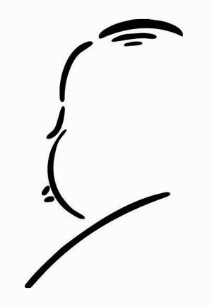
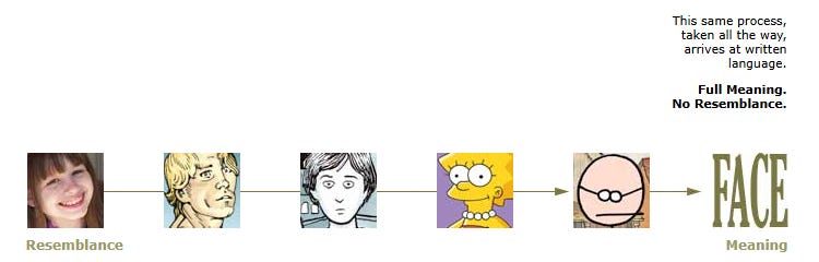
For McCloud, that portrait would be more iconic than a photograph of Hitchcock. This conceptualization couldn’t be further from Peircean thought, since Peirce would argue that the more something clearly and unambiguously represents something else, the more iconic and less symbolic it is. For McCloud, though, the icon lies about two thirds of the way between “resemblance” on one end, which is passively received, and “meaning” on the other, which is actively perceived. And once icons stop being icons, they immediately transition into… the printed words of a phonetic alphabet:
Here’s another demonstration of the same sliding scale, from McCloud’s personal website:
McCloud then comes up with a triangle figure. The top, which opposes both resemblance and meaning, indicates pure abstraction. Visual realism is on the left, and visual meaning is on the right.
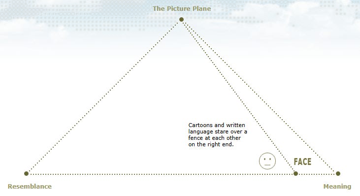
So, completely non-representational works (like Jackson Pollock’s or Barnett Newman’s paintings) go at the top, photographs go on the left, and language-signs go on the right. And at the furthest right, the absolute edge of the triangle, we have, like, lots of language signs, lots of words… and they’re written in italics, or scribbled handwriting, or something. But somewhere in the sweet spot (about two-thirds through), we get the images of comics. The classic comic style of art shows up in that pristine area, and it runs all the way up to the phonetic alphabet, where it becomes language.
Now, I want you to ask yourself this question, and try to be as honest as you can. No — ask yourself a couple. Does the progression from a photo of a face, to a realistic drawing of a face, to a stick figure drawing of a face, to eventually the word “FACE” feel natural to you? Let’s expand his example a little. If I draw a stick figure of a whole body, am I somehow just a stone’s throw away from writing out the word “BODY”? or maybe “STICK FIGURE”? Let’s push this example even further. If I draw a simplified picture of an Extreme Ultraviolet lithography machine, am I conceptually just a hair’s breadth away from writing out the words “EXTREME ULTRAVIOLET LITHOGRAPHY MACHINE” instead of drawing the picture? Well?
To that last question, McCloud might respond,
Well, no, because any drawing detailed enough to make the specific type of machine recognizable would have to go further toward ‘resemblance,’ while any description of the machine with several words would have to move closer toward ‘meaning.’ If you wanted to bring them as close to each other as possible, you would have to draw a highly simplified and thus non-specific machine, and the word next to it would just be ‘MACHINE.’ Then, as they diverge, you could specify what kind of machine it is, through intricate visual depiction on one end and intricate written description on the other.
That seems like what he would say, anyhow (I’m trying my best to ‘steelman’ the argument here). But if that’s true, then how does a more intricate drawing — intricate enough to show us the exact type of machine it is — go further away from meaning, while a more thorough verbal description goes closer to it? Let’s consider this whole entire concept of “meaning” for a moment. Is there no “meaning” at all in a photograph if it tells you everything that a lengthy verbal description would tell? Is there no “meaning” in detail when it’s portrayed visually? And how is it just passively “received” — doesn’t it require more active interpretation the more detail there is? If I can see all the parts of the machine, I’m forced to think about what they actually might do in order to identify it, am I not?
Let’s alter the line of questioning a bit: is meaning really rooted in verbal abstraction? And more importantly, if we’re assuming that this is the case, then how does this attitude not betray a glottocentric (AKA language-centric) theory of communication, exactly the thing that places novels above comics in value? It seems to me that the more you disambiguate something, the more meaning there is, so a picture of (for example) a bird detailed enough to tell you its exact type carries more meaning than an “iconic” drawing that could indicate potentially a hundred different kinds of birds.
The truth is, there’s just simply no smooth transition going from a photograph to a simplified drawing to a word written in the phonetic alphabet. Interpreting a simple picture and interpreting a word involve entirely separate mental processes located in separate parts of the brain. It seems to me that what McCloud wants to do is say that simple images and words written in the phonetic alphabet are both similar because they’re visually less cluttered and less distinct, and perhaps this means they have less “ground,” to use the term from the legendary media theorist Marshall McLuhan (McCloud is a McLuhan guy, which I don’t consider a bad thing at all). But here’s why Peircean semiotics shouldn’t be ignored: no matter what superficial similarities a simple image and a written word in a phonetic alphabet share, the picture still has an iconic referent (i.e., something that it portrays through motivated resemblance) while the written word has no iconic resemblance to hardly anything besides other instances of the same written word. That is a huge conceptual difference. If you really wanted to represent the transition from picture to word correctly, you’d have to put a giant gap between them, maybe with a “???” in the middle. And when you think about it, this need for such a gap is exactly why the phonetic alphabet was such a revolutionary invention, such a great leap forward for the ancient Greeks — a truly profound discovery not to be bested by Lysippos’s innovations in anatomical realism (and, for reasons I’ll explain in a bit, I don’t think it’s a coincidence that the same culture that produced one would also produce the other).
Someone will now say, “But what about hieroglyphics, Kerwin? Aren’t they drawings?” and sure, yes, they are. And some of them did carry iconic resemblance — or, in other words, some of the glyphs were logograms, drawings that directly signified their apparent referent in an iconic, motivated way. But the problem is that these logograms were only a minority of the hieroglyphs, while the others either signified sounds, like full syllables or entire words, while others still acted as contextual determinatives to clarify the meaning of the sentence without being pronounced at all. This is why the hieroglyphic script was supremely elite, only known by the highest of clerics, while merchants, jurists, and accountants would use the more streamlined and sound-based (though not completely alphabetic) hieratic script, and then later, the even more streamlined and more sound-based (though still not totally alphabetic) demotic script, which looked like this:
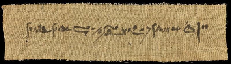
Yeah, you see that? The script where you don’t recognize anything at all is easier to learn than the thing with the recognizable pictures. So, this is my point: if you look at a series of hieroglyphics simply as icons (in either Peirce’s or McCloud’s sense), they’re incredibly simple. Couldn’t be easier to interpret. Look, there’s a bird! And wow, there’s an eagle! And hey, a feather! Oh, but there’s a stick… But if you look at them as how they were intended, namely as symbols (in the Peircean sense), all of a sudden they become more or less impossible. There’s a reason we weren’t able to translate hieroglyphics until all the way up to the 1820s, and it’s one of the reasons why hieroglyphics were fully abandoned by the 5th century A.D.: they were complicated as shit, and highly inefficient! And again, all of this is because iconic interpretation and symbolic interpretation involve totally separate mental processes. They cannot be placed together upon the same linear sequence.
II. The Image and Language as Mutually Evolving Phenomena
I kinda hate to beat up on McCloud so badly here, because he doesn’t return to his “picture plane” for a few chapters, and the intervening ones are quite good, as I’ve said. But alas! He does return to it again in Chapter 6, and his conceptual flaws here lead to further errors, all of which concern the same misunderstanding regarding the relationship between visual images and language.
In Chapter 6, McCloud wants to explain why the combination of pictures and words is now considered crass and lowbrow. In order to do so, he tells the story of pictures and their relationship with words, and McCloud shows how humans once created representative images before they ever developed literacy. Some of these images were fairly intricate, while others were “iconic” and acted as “symbols.”
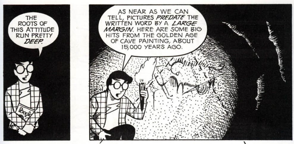
Already, we’ve got some problems. It isn’t altogether clear if McCloud believes that primitive drawings naturally evolved into language, or how exactly the process came about. But the more important thing he misses, I think, is that while it’s true that humans made cave paintings 15,000 years ago, those were not the first images humans ever made. As Andre Leroi-Gourhan pointed out in his Gesture and Speech (1964), the first images humans ever made were not representative of anything at all: they were purely abstract notches, waves, and other assorted scratchings on things like rocks and bones. Think spirals, clusters of dots, and rows of little lines, like this:
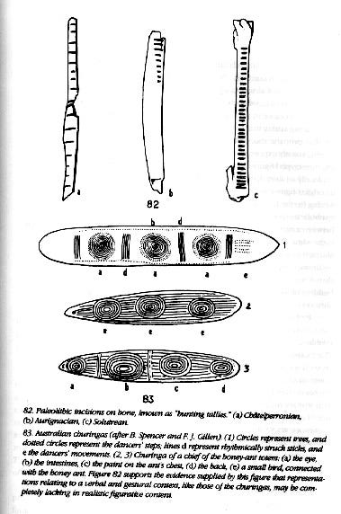
They indicated rhythm more than anything, and it was probably fun for those guys to just move their hands about in various patterns to create these little designs. Although there are some theories that such scratchings indicated specific things (like kill counts in hunting), I kinda doubt it, as do many others. As far as we can tell, they were purely non-representational.
Now, think about language for a second. Language started out orally, not written, and it’s a collection of phonemes that are assigned symbolic significance. Language is abstract, and it certainly came before the cave paintings at Lascaux to which McCloud is referring. It isn’t clear if hominids were making non-representative scratchings before they developed language or only afterward, but language was a way of exteriorizing and formalizing a rhythmic, predetermined series of abstract utterances. It therefore comes from the same psychological substrate that prompted early man to create those little scratched-out notches and waves pictured above, even if they were far from being formalized with the same ingenuity. Language also, I think, was a necessary innovation for representative art to come along much later, like in those Lascaux cave paintings, since language gave man the gift of cognition — or at least a cognition sophisticated enough to imbue images with specific functions (like map-making, or warning others, or practicing magic). So from the beginning, abstract shapes and lines were there alongside language. It took a good while for mankind to finally reunite his earliest visual inscriptions with symbolic meaning, but regardless, the impulse to make non-representative drawings was there before representative pictures.
Now, the reason this matters so much is that it shows how visual images and media (including spoken language itself) have always evolved in an intertwined fashion. Even though they occupy different modes of interpretation, they still can mutually influence one another, if in unexpected ways. Language and abstract scratchings came about around the same time, and then, much later, cave paintings showed up around the same time as more complex tools were being developed. Literacy eventually showed up thousands of years later, and it was essentially a mnemonic tool for stock-taking, economic, and administrative purposes. So it was effectively an extension of earlier tools, and it took a while for people to use for cultural or aesthetic purposes.
For McCloud, innovations in language media slowly created an effect wherein pictures and language became gradually separated from one another. He argues that the printing press in particular pushed language into one direction while images evolved in an opposite direction. But as Marshall McLuhan has (I think correctly) observed, the printing press was responsible for the Renaissance innovations in visual perspective, like the “vanishing point,” since the uniformity of the printed page created the illusion of a fixed point-of-view. So again, a language medium allowed the visual image to evolve in complexity, even though they involved different interpretive practices.2 Moreover, the printing press brought written language closer to what McCloud calls “the icon,” since the letter had never been so visually bold and clear beforehand. The press even led to the standardization of spelling and grammar, creating maximum clarity and ease of absorption.
It also doesn’t seem to be the case that the printing press pushed language and images in opposite directions by prohibiting them from intermingling. Intricate images still occurred throughout the age of print, and they interacted with texts to which they corresponded, but not in the way McCloud has in mind. The most obvious example is in the way paintings from the Renaissance all the way into the nineteenth century depended upon the Bible and its associated tradition. Sure, these paintings weren’t photographed and copied into the printed editions of the Bible (an impossibility), but they were clearly designed to interpret the text creatively, creating a kind of mutual interaction between the painting and the Biblical scene being depicted. For instance, if you look at Caravaggio’s highly detailed The Calling of Saint Matthew, c. 1600, his interpretation is so striking that it threatens to assume sovereignty over the story itself. It becomes nearly impossible to think of that episode from the Gospels the same way again.
At other times, elaborate images formed the frontispieces to many different kinds of books, and these frontispieces often relied on a certain kind of conceptual glue known as allegory to portray the book’s ideas. For instance, the frontispiece to Robert Burton’s Anatomy of Melancholy (1628 edition) depicts the many different states of mind that Burton is about to expound upon, and it actually looks quite a bit like a comic strip. In fact, many of these frontispieces did. The frontispiece to Thomas Hobbes’s Leviathan (1651) was actually drawn in close collaboration with the author, and through allegory, it visually portrays Hobbes’s philosophical argument about statecraft and the figure of the sovereign. It was heavily commented upon back then, and it still receives academic analysis to this day.
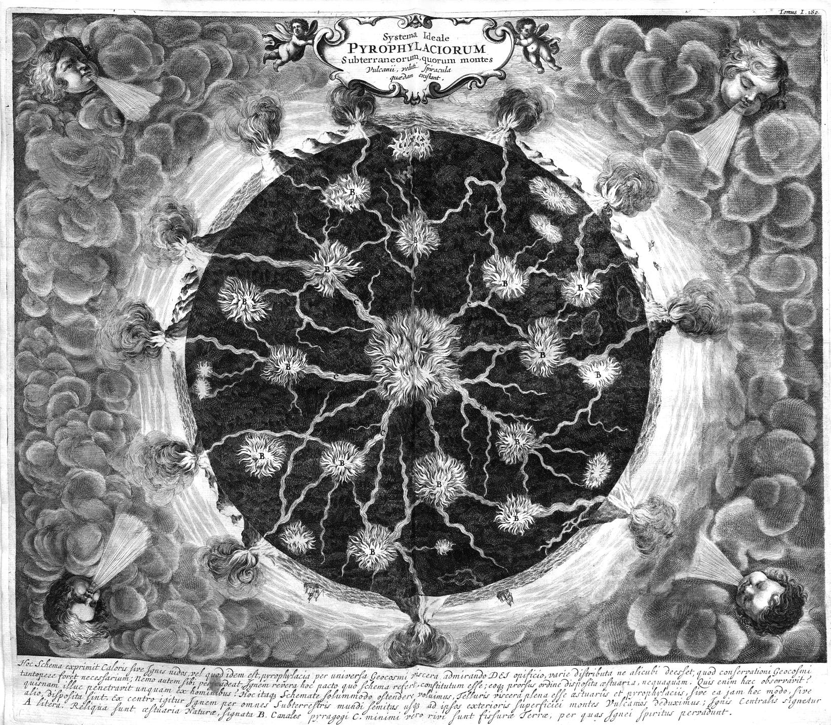
If you probe further, you’ll find books loaded with folio images, like those of Athanasius Kircher, the 17th century German polymath. Kircher not only had incredible and often highly allegorical frontispieces drawn for his books (great works of art in their own right), but he loaded up his books with folio images of maps, diagrams, and models, like this fascinating depiction of the earth’s core from his Mundus Subterraneus (1665):
And then there was the genre of emblem books, which were loaded up with images that contained written explanations next to them, since it was prohibitively difficult for a printing press to mix writing with images at the time. Among the most striking of the emblem books is Michaelis Maier’s Atalanta Fugiens (1617), an alchemical treatise filled with not only intricate allegorical images but also poems, and even music pieces for chamber performance, all while slowly recounting the Greek myth of Atalanta and Hippomene (see the emblems in color here).
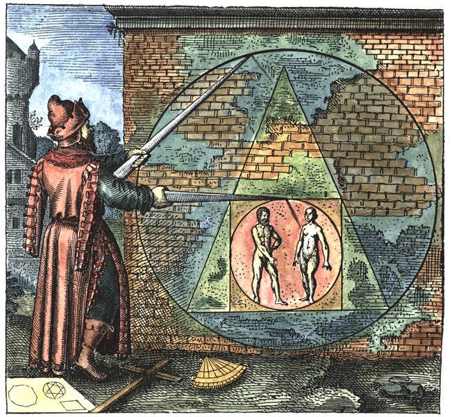
Again, all of this involves heavy intermingling between text and image — and music, for that matter.
When William Blake finally came along in the late 18th century, it should go without saying that he took poetry and illustration into unknown territory. He invented his own idiosyncratic printing method known as relief etching, which allowed him to combine words with images on the same page with much greater ease, and once he used it to produce his own works of “illuminated printing,” he became nothing short of revolutionary. However, he was a revolutionary who failed to incite a revolution only because of how bold his vision was. The illustrations we typically find added to reprints of the Rubaiyat of Omar Khayyam (1859) or Robert Louis Stevenson’s A Child’s Garden of Verses (1885) pale by comparison to the conceptual unity we find in Blake’s Jerusalem (1804-1820), or his Marriage of Heaven and Hell (1790-1793), and it amazingly took quite a while for twentieth century academic literary scholars to realize that Blake must be read with his drawings — his drawings must be taken just as seriously as his words! But as sui generis as Blake was, it still must be understood that he was coming out of an earlier print-based tradition in which both image and text mutually augmented one another, even if the technology didn’t allow for images and writing to occur within the same space. And yeah, sure, these images don’t look like modern comics… but who cares?
It therefore just isn’t accurate to say that text and image became alienated from one another during the age of print. As I’ve noted, the modern comic only came along during the nineteenth century, and there wasn’t anything too much like it beforehand, even prior to the Renaissance. McCloud, who considers the 11th century Bayeux Tapestry a comic, seems to believe that an alienation occurred after a mutual harmony between text and image. But once you recognize that logogrammatic language scripts weren’t being treated the same way we typically treat representative works of art, and that his examples of early sequential art weren’t exactly common, you quickly realize that the harmony he’s imagining was never really there. What the new medium of print accomplished was to allow both language and visual art to reach levels of complexity never seen before, but there’s no reason to assume that their complexities were growing in opposition to each other. Works of art like the Bayeux Tapestry were never the norm, and as McCloud recognizes, sequential art never stopped being produced during the age of print. He himself mentions examples. There’s also a big, giant book of examples collected by David Kunzle called The Early Comic Strip: Narrative Strips and Picture Stories in the European Broadsheet from c.1450 to 1825 (1973). I haven’t read it, though, so I won’t comment on it. Maybe I will sometime soon.
Still, we haven’t yet answered the question McCloud poses as to why images eventually became devalued and relegated to lowbrow status during the 20th century — unless, of course, they were highly abstract, and (ironically enough) incredibly primitive. So primitive, in fact, that they were going back to Homo erectus times, back to the times of those non-representative swirls, spirals, waves, dots, and notches. McCloud’s view is that pictures and words had been pushed so far to opposite extremes, they each had nowhere else to go but to reconvene at that breaking point between “icon” and “word,” but because all of this happened through the mass media, people scoffed.
Despite his terrible “picture plane” model, I think he’s about half-right on that last point. I suspect that the reason has to do with the advent of electronic media, which cheapened the image by making it endlessly reproducible and available to everyone, thus eliminating its uniqueness and its mystique once and for all. And in America, when comics in the style of Töpffer’s “picture books” became mainstream entertainment among working class Italians, Puerto Ricans, and Irishmen, there was no chance for redemption in an Anglo-dominated society (the French and Italians, for their part, never had these social status problems that McCloud identifies in their own countries). Meanwhile, intellectual Jews such as Clement Greenberg, Harold Rosenberg, and Leo Steinberg were theorizing about art and then effusively praising the artists who demonstrated their theories. As Tom Wolfe pointed out in The Painted Word (1975), modern abstract art had become subordinated beneath theory to such a degree that it derived its sole aesthetic value from it. This was an altogether new phenomenon, not to be found during the days of the Church’s dominance over the west.
III. Visual Stereotypes, Schemata, and Comics
We come to McCloud’s most criticized claims, and these are the claims that most clearly reveal his need to try and elevate the dignity of comic book art. Cartoons have traditionally not been terribly detailed, as we’ve established, and McCloud wants to give us a way to appreciate works of art that aren’t photorealistic — works of art that rely on stripped-down visual forms that small children can appreciate just as well as adults. This is a worthy enough aim. But again, he runs into the same problem established by his “picture plane” triangle. It happens when he tries to suggest that mere simplicity is the essence of the cartoon, as he does here:
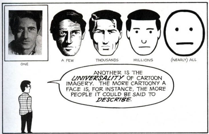
“The more cartoony a face is … the more people it could be said to describe.” Again, is that really right? Just look at the picture to the furthest right. Would you say that it’s the most cartoony out of all of them? I certainly wouldn’t say so; in fact, it looks humorless and bland. The guy on the far right could only be the protagonist of a pretty shitty cartoon. Let’s think about that for just a second.
There are a handful of guys that McCloud totally omits from his analysis, and perhaps he should have included them. They’re the caricaturists. He does discuss Rodolphe Töpffer, as we’ve mentioned a few times… but then there are guys like the inventors of the caricature, the Caracci brothers: Annabale, Agostino, and Ludovico (mid-16th to early 17th centuries).
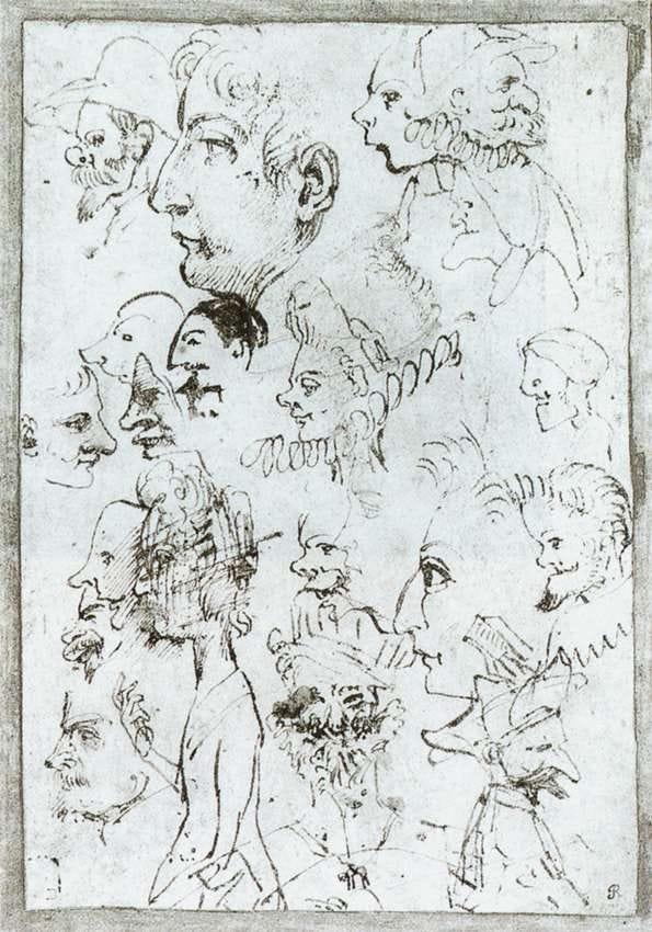
The art historian E.H. Gombrich, in his Art & Illusion (1960), discusses trying to figure out with a colleague why it took so late in western art history for the caricature to have been invented. So, to try and answer the question, he contemplates these fascinating bros:
The word and the institution of caricature date only from the last years of the sixteenth century, and the inventors of the art were not the pictorial propagandists who existed in one form or another for centuries before but those most sophisticated and refined of artists, the brothers Carracci. Few of their caricatures have been identified, but according to literary sources which we have no reason to doubt, they also invented the joke of transforming a victim’s face into that of an animal, or even a lifeless implement, which caricaturists have practised ever since.
We thought at the time that it was the fear of image magic, the reluctance to do as a joke what the unconscious means very much in earnest, which delayed the coming of that visual game. I still believe these motives may have played their part, but the theory might be generalized. The invention of portrait caricature presupposes the theoretical discovery of the difference between likeness and equivalence.
[…]
IN THIS formulation caricature becomes only a special case of what I have attempted to describe as the artist’s test of success. All artistic discoveries are discoveries not of likenesses but of equivalences which enable us to see reality in terms of an image and an image in terms of reality. And this equivalence never rests on the likeness of elements so much as on the identity of responses to certain relationships. We respond to a white blob on the black silhouette of a jug as if it were a highlight; we respond to the pear with these crisscross lines as if it were Louis Philippe’s head.
He’s referring to this 19th century caricature of Louis Philippe I:
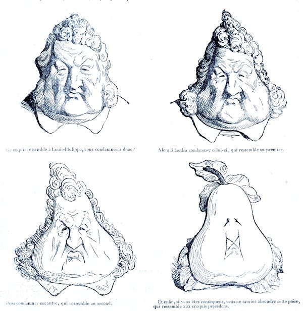
Gombrich’s analysis of art seeks to deny (or at least seriously compromise) the validity of iconicity as a concept. He’s one of those guys I’ve written about who are suspicious of the icon as a valid semiotic category, and this is why he can’t fully bring himself to say that the caricaturist is embellishing characteristics that are really there. But his point is nonetheless well-taken: caricaturists were able to come along because they practiced a bold kind of experimentation. That is, they were able to borrow the forms of other known objects and superimpose them upon their subject, doing so in a way that seemed acceptable to the audience. They also sometimes made up their own forms and tinkered with them, finding a way to synthesize these alien forms with the faces of their subjects until it would unlock some hidden essence of the subject’s appearance or personality. So they weren’t just “simplifying” the images but actually introducing an element of distortion, exaggeration, and grotesquery as well. That is the essence of what makes an image cartoony. Simply reducing the cartoon to lack of detail effectively neuters what makes a cartoon special.3
There are other caricaturists that McCloud doesn’t mention, either, like William Hogarth (1697-1764). Actually, that isn’t quite right. He mentions in Chapter 1 that Hogarth created works of sequential art, like A Rake's Progress (1732-1734)... but he ignores the fact that Hogarth was also a caricaturist. And I don’t think it’s a coincidence that the same guy who experimented with sequential art would also have experimented with caricature. Hogarth, like many of the other innovative caricaturists, wasn’t interested in slavishly copying likenesses as they appear in nature. As Gombrich points out, he was interested in “learning the language” of objects and finding a “grammar” to them. In other words, he didn’t see the need to simply copy models posing in front of him, but rather to memorize forms for the various physiognomies and expressions of the human face and body, respectively, and then experiment with them.
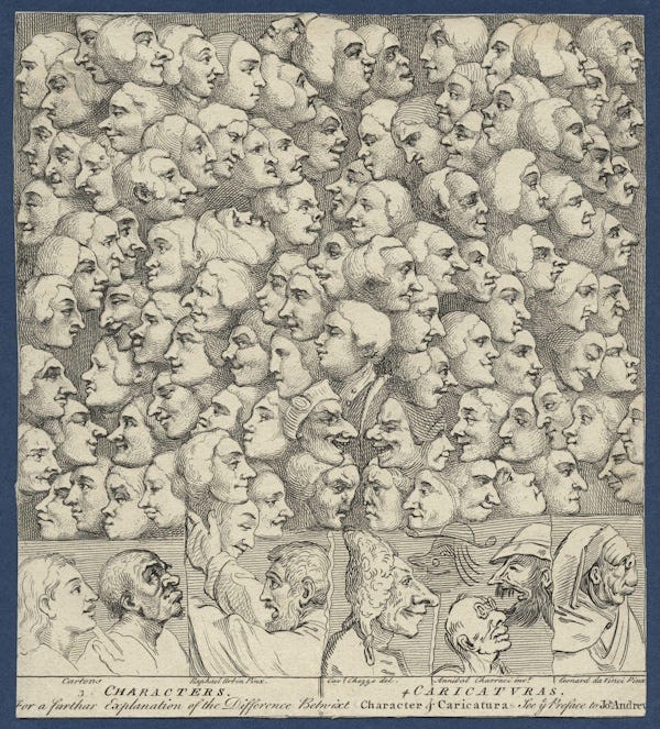
Others had the same basic idea and pushed it even further, like Alexander Cozens (1717-1786), who advocated for intentional deviations from the canon of standard classical beauty when drawing comic faces. And then there was Francis Grose, who in 1788 published a pamphlet called Rules for Drawing Caricatures. Again, here’s Gombrich:
It certainly met a demand at the time when the merging of the Hogarthian tradition of comic art with the fashion of portrait caricature led to a popular craze for such drawings among amateurs. Grose combines the diagrams of [Charles] Le Brun with the variation principle advocated by Cozens. The academic standard face, which corresponds to the canon of Greek art, is experienced as beautiful, he says, precisely because it lacks expression. Try varying the proportions as drastically as you like, and watch what happens. You will soon be equipped with a repertory of funny faces that will be useful in drawing humorous pictures.
Ah, yes, there we go! Humor! Expression! Experimentation! Distortion! Imagination! This, my friends, is the essence of the cartoon image — NOT the stupid three-pronged American-style electronic outlet just staring at you blankly:

Now, if you consider how McCloud reduces the cartoon to simplicity, then the cartoon as a category must include all sorts of things, like the weird medieval guys from those high-medieval manuscript illuminations. And given how silly some of them look, not to mention the elements of scatology in some of the images, we can perhaps accept this classification (although it’s also clear that the artists weren’t usually trying to be funny). But his reduction of the cartoon image would also have to include the Grecian vase paintings and Chaldean bas-reliefs. It would also have to include the stick figures on those “pedestrian crossing” signs. Is any of this right? Yes, these things are all simplified images… but are they cartoons? Do they carry the same function as cartoons? Do you they make you feel the same way?
The answer — for me, anyway — is mostly no. And if I interpret some of these things as cartoons, like the depiction of the Christ on the mount of olives in the famous Book of Kells, then some better part of my judgment knows that I’m interpreting it the wrong way. Meanwhile, the work of Honoré Daumier is cartoony as hell, and yet it is highly detailed, not simple. So why does McCloud insist that naked simplicity is the essence of the cartoon? What could his argument gain from such a misrepresentation of what we typically think of as cartoon drawings?
We finally come to the crux of McCloud’s argument: the reason for why he’s so insistent on simplicity tout court as the essence of the cartoon. And it is indeed the most-criticized claim he makes. For McCloud, the advantage of such simplification is that it allows the reader to psychologically project himself or herself onto the character, using the character’s appearance as a mask. Essentially, the simplified form exploits the viewing subject’s primary narcissism. This psychological theory has been widely criticized from a number of angles, and I don’t want to spend too much time on it for that reason, but I can’t resist quoting the way he makes his point:
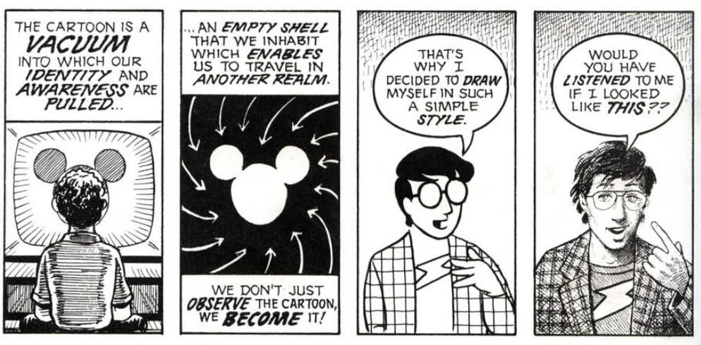
I know I can’t be the only one who read that question and thought to himself, “Uhhhh, yeah. Sure, I would. Why not?” But even if the answer had been no, it wouldn’t be because I need to see myself as McCloud in order to find what he says interesting. It would have more to do with the fact that the realistic figure is more alluring and interesting than the text above him, while the simpler figure is easier to register, gives me less to care about, and thus directs my eyes right to the text.
Usually, the appeal of simplicity isn’t about man’s inherent narcissism. Maybe sometimes, but not usually. For one thing, cartoons often involve a protagonist and an antagonist, and it isn’t as though the antagonists are maximally detailed so as to alienate them furthest from the viewer. Bluto is just as simple as Popeye. Peg-Leg Pete is just as simple as Mickey Mouse. Tom is just as simple as Jerry — it’s not as though Tom is played by a live-action cat. When I watch the Roadrunner outwit the Coyote, am I supposed to sympathize with both of them at once? Is the entire spectacle of their mutual antagonism just an internal psychomachia taking place inside of me, in which one faculty of my mind is at war with another?
Not to put too fine a point on it, but I think that it’s just too cute of an idea to take seriously. The process through which a viewing subject will start to identify with a character is an interesting phenomenon, and it certainly is real, but it happens all the time in, say, film (see the final girl theory). It happens in television. There are actually transsexuals who claim that playing as a female character in video games — including those with precise graphics and detail — eventually awakened their transsexual urges. All of these examples seem to indicate that formal simplicity has little to do with the process of identification. Plus, simplified forms can be just as “othering” as they are inviting. This is probably why Scott McCloud doesn’t address the rich history of ethnic stereotypes in cartoons, which are indeed quite funny and enjoyable, and very cartoonish.4 But despite being amusing, these presentations always portray the ethnicity as a grotesque heterogeneous figure — there’s nothing instantly relatable about, say, Sunflower, the now-erased character from Disney’s Fantasia (1940):
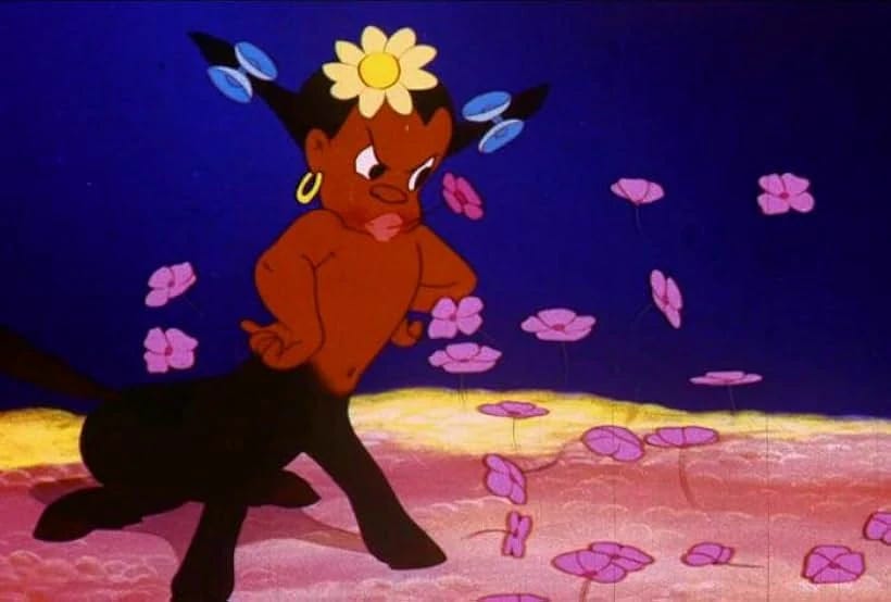
The nature of the cartoon is better understood as something that triggers an instinct inside of us. A culturally conditioned instinct, perhaps, but an instinct nonetheless. McCloud starts to apprehend this instinct when he talks about how we always liken inanimate objects to the human form (like that three-prong outlet above), but he misses the mark when he says that we’re all just looking for versions of our individual selves. Rather, humans have always responded to distillations or exaggerations of broad categories, like e.g. in the form of literary or stage play “stock characters,” like those found in burlesque theater, the performances of the medieval jongleurs, the Commedia Dell’arte, or puppet shows such as Punch and Judy. And the reason we’ve always had an interest in such imaginative embellishments is that they correspond to the way we internally characterize and classify the types of phenomena we encounter in the world. Essentially, we’re all walking around with an array of schemata loaded up in our minds that we project outward onto our surroundings, and each schema acts as a lens through which we interpret what we encounter. Some might call these schemata “archetypes,” as C.G. Jung did, while others might call them “stereotypes.” But however we conceptualize them, we develop these things through a complex mixture of native instinct, direct personal experience, and cultural conditioning.
The visual form of the cartoon plays upon these schemata in a humorous fashion, and whether we like it or not, such schematized presentations of life can’t be considered highbrow or intellectually respectable in any meaningful way because they are indeed so psychologically nonspecific. The highbrow mentality insists upon us recognizing the individuality within everything. When we’re being highbrow, we’re engaging in lengthy interpretations of all the psychological particularities that go into this person or that person. The cartoon, on the other hand, invades your mind with deeper and sometimes darker truths that resonate with the animal senses — truths that language will always fail to capture adequately. Yessss, the cartoon hisses into your ear, tickling the cartilage with its forked tongue, that man with the speech impediment sounds utterly RIDICULOUS! Let us laugh at his misfortune! Oh, and look over there! That redheaded woman with the big boobs — she sure is SEXY! Watch as her mammoth-sized mammaries jiggle hither and thither, to and fro! And Yessssss, it continues, look at that Polack standing at the streetlamp! Observe his shabby appearance juxtaposed against his austere countenance! Say… wouldn’t it be FUNNY if he slipped on a banana peel??? Violence is a GAS!!!! And so on.
What McCloud does to divert our attention from this awkward yet undeniable truth is set up a semiotic model wherein maximum value is placed upon simple character designs because they’re more “meaningful,” since they invite us to imaginatively project ourselves upon them. But in doing so, he winds up creating a much worse problem, and it’s a problem that has plagued the comics and animation industries for the last thirty-five years or so. Although I don’t think McCloud has been solely or even majorly responsible for the growth of this problem, it is a problem that his thinking demonstrates nonetheless. Whether intentionally or not, he winds up indicating that the real value of the simple character design is in its proximity to language.
I already mentioned way back in Part I that McCloud’s “picture plane” triangle is inherently language-centric because of how it assigns maximum “meaning” to the written word, but I think that only now the implications can be fully explored. When you look at all of the most highly rated, critically appraised comics, they all seem to involve simple-looking characters, not even particularly cartoony ones, and they have deep, deep thoughts. I’ve already mentioned Maus and Persepolis, but then there’s Fun Home by Alison Bechdel (2006), various projects by Daniel Clowes, Love & Rockets by Los Bros Hernández (1981-), Craig Thompson’s Blankets (2003), and plenty of others. And look: I don’t want to attack all of these things. I think Love & Rockets is great, personally. But most of these critic-friendly comics derive their value from their writing rather than their art, to such a degree that they’ll often prompt me (and many others) to ask, “Why am I even reading this and not an actual novel?” At best, this combination of simple art mixed with psychological realism (or perhaps ideological/philosophical complexity, or some other uniquely novelistic feature) can yield something like a Love & Rockets, which has excellent character design, great visual storytelling, and shows strong awareness of both the history and potential of comics as a medium. But at worst, you wind up with, well, a gaggle of opportunistic hacks who aren’t literate enough to write a real novel and can’t draw well enough to produce a great superhero comic, or crime comic, or horror comic, or bande dessinée in the style of Blueberry or Thorgal, and so they settle on producing sheer “slice of life” mediocrity. On the whole, the desire to achieve critical respectability has harmed comics, and it unfortunately involves a kind of style that McCloud’s theorizing privileges.
Not only is the problem bad in comics, but it’s bad in animation, too. Bojack Horseman is probably the best example of what one critic has called “therapeutic realism,” a kind of novelistic approach but tailored specifically to the nuances of therapy culture and all that it stands for. And while such realism more often shows up in live action entertainment (although there’s also Tuca & Bertie, not to mention Big Mouth), Raphael Bob-Waksberg’s use of cartoon animals to convey it here pretty much goes by the Scott McCloud playbook to a tee. Simple and crude character design, maximum proximity to the word — the holy, sacred word. This is why the show can feature an episode in which the main character devotes about 90% of the runtime to self-indulgent monologuing about all of the problems he has with his mother. Hey, I have a question. If I must be subjected to such blathering nonsense, can I at least get some pretty pictures to go with it?
By my account, the value of comics isn’t necessarily in the fact that they’re cartoony (they don’t have to be cartoony to be good, and many of the best aren’t), but it is largely in the fact that comics are a lowbrow art without novelistic pretense. People don’t quite understand what this means, because when they think “lowbrow,” they think technically unimpressive or undisciplined. But this has never been the case. Monster trucks are lowbrow, but they’re also masterpieces of vehicular modification, and they require great driving skill to master. Pro wrestling is lowbrow, but it’s essentially an athletic form of theater that takes years of practice and conditioning to excel at. Death metal is lowbrow, but it involves rigorous technical musicianship and stamina, especially if you’re the drummer. Pole dancing is lowbrow, but it requires impressive calisthenic ability and proprioception, especially if you’re doing it the proper way, i.e. at a strip club in eight-inch heels. Jazz was once lowbrow,5 but the critics decided to start loving it all of a sudden, and then it became “music for musicians.” Bodybuilding is lowbrow, but it requires a lot of time spent in the gym, plus the endurance to starve yourself nearly to death, and some serious knowledge of chemistry. You get the idea.
In an interesting way, McCloud managed to create a model which actually confirms my point, because he places technical drawing skill in such stark opposition to the written word that he essentially renders the former completely optional — if not, quite frankly, undesirable. Of course, this opposition is imaginary, as I’ve stressed, but it gives us intelleckshuals all the reason in the world to turn our noses up at, say, a pornographic and ultraviolent yet stunningly impressive sci-fi comic like Paolo Eleuteri Serpieri’s Druuna (1985-2018), while we now have all the theoretical justification in the world to drool over something like Art Spiegelman’s Maus, even though any single volume of the former required far more brilliance and ingenuity to create than the entire run of the latter. In response to this mentality, I say, paraphrasing Thomas Carlyle: open thy Druuna and ignore thy Maus.6 Comic books are a visual medium, their meaning comes from images, and when comics are properly made, the image is the master, and the word, its envoy.
Alright, that’s enough rambling for today. I’ll see you later.
Edit 6/16: I tidied up some grammar and fixed some typos, made some light edits for clarity and disambiguation. Added a few hyperlinks.
From a pamphlet on physio-gnomics published in 1845 (I quoted from E.H. Gombrich’s Art & Illusion, 1960, and I’ll talk about this book plenty later in the essay)
For a parallel development in earlier times, I’ve already mentioned the phonetic alphabet preceding the anatomical realism of Lysippos. But visual media can also change our orientation to language, since in more modern times, there is no denying that the invention of cinema changed the way we both read and write novels.
A good modern example of sheer cartooniness via (often surprisingly cruel) distortion and grotesquery can be found on the YouTube website for “Caricature Party,” two caricaturists located in Hawaii
Yes, they really are, and their enjoyability is in fact why people get so morally outraged by them today. After all, if they weren’t compelling, why would there be such a pronounced need to police them in the first place?
Listen to the interviews in Jelly Roll Morton’s 8-CD Library of Congress Recordings box set, if you don’t believe me. Or, even if you do, you should listen to them anyway!
Or, you know, it doesn’t have to be Druuna. It could also be Jodorowsky & Manara’s The Borgias (2004-2010). Or Henriette Valium’s Palace of Champions (2016). Or Rudolph Dirks’s Katzenjammer Kids (1897-1913). Or Frank Thorne’s Ghita of Alizarr (1983-1985). Or Frank Miller & Geof Darrow’s Hard Boiled (1990-1992). Or Go Nagai’s Devilman (1972-1973). Or Druillet’s Lone Sloane (1970-2000). You’ve got options.
Rich, thought-provoking and timely essay–your best yet!
A hundred years ago, the woodblock novel was growing in critical and popular esteem. The form was killed by WWII. Why? The postwar academic consensus held that image-based storytelling is inherently fascist, or at least that it appeals to the lizard-brain in ways antithetical to smooth-functioning liberal technocracy.
I think you’re right that McCloud’s rehabilitation of comics, half a century later, came at a cost: the graphic novel was granted respectability to the extent that it subordinated the image to the word. I’d argue that the generative AI revolution recapitulates that maneuver on a cosmic scale: it promises to greatly increase the ratio of imagery to text online, but all of this imagery is controlled and mastered by a hidden semantic layer.
I love your paraphrase of Gombrich on William Hogarth: that the latter was engaged in discovering a “grammar” of objects. And I second your call for cartoonists to re-ground themselves in this primary practice, for McGilchristian reasons.
As for you, here’s where I’d love to see you develop your thesis: you give us some intriguing stuff about the development of allegorical illustration in the early print era–frontispieces and emblem books–and you give us equally interesting stuff about the invention and development of caricature during the same period. But I’m not getting the connection between these two developments. In fact they would seem to be almost antithetical: emblems and the like are about distilling abstract ideas into concrete representations, while caricature in its purest form eschews abstract “meaning” to focus on distilling forms and relationships. Or is there a commonality I’m missing?
Again, thanks for a great and inspiring read.
Would love to read a review from you about why Maus isn't a masterpiece (even though it is)